“The dark blue colour is bang-on and what I envisioned. Love the movement of shapes throughout the materials and how it doesn't feel like typical realtor branding! Exactly what I've been trying to get away from, it's perfect”
— Nevada Cope —
Nevada Cope
Meet Nevada, a distinguished real estate professional specializing in residential and commercial properties within Metro Vancouver. What sets Nevada apart is not just her in-depth market knowledge, but also her vision for a unique and captivating brand identity.
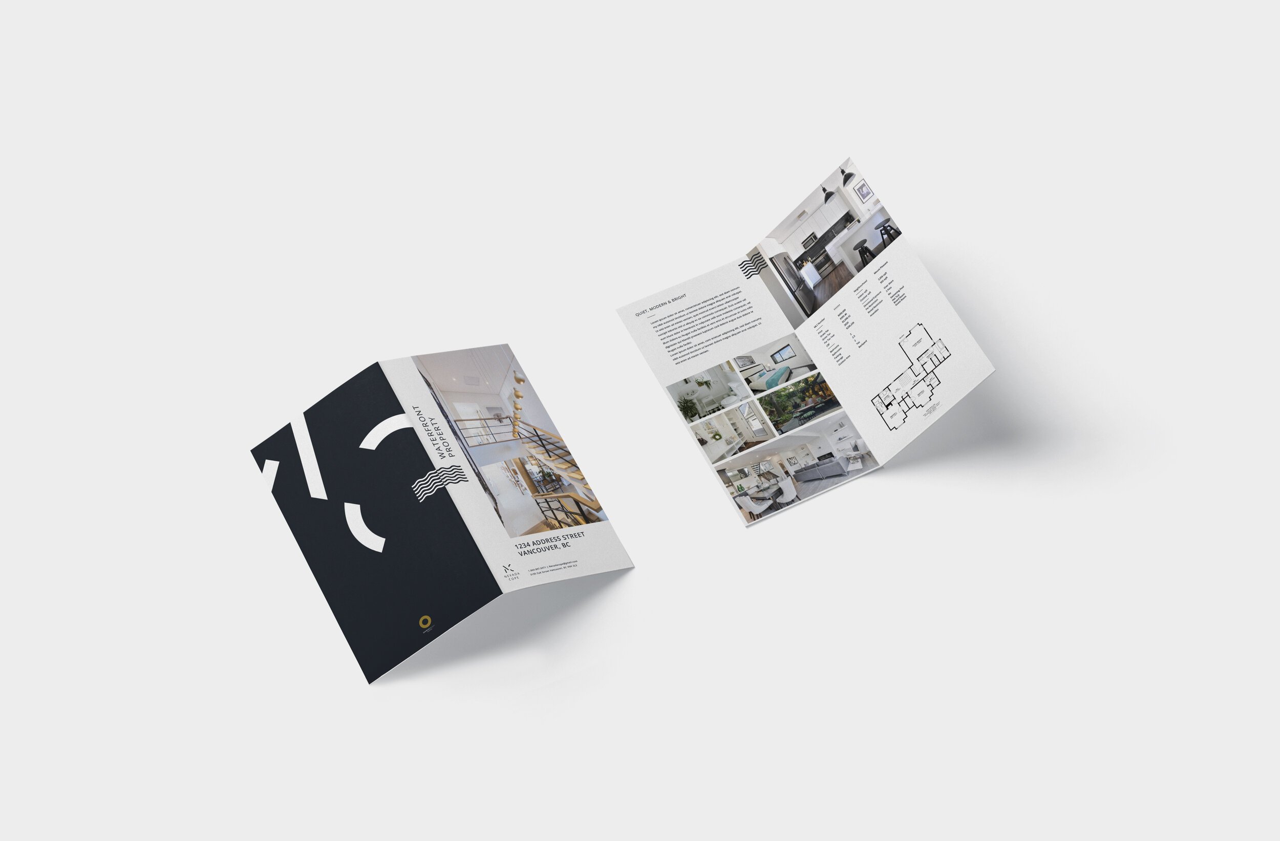
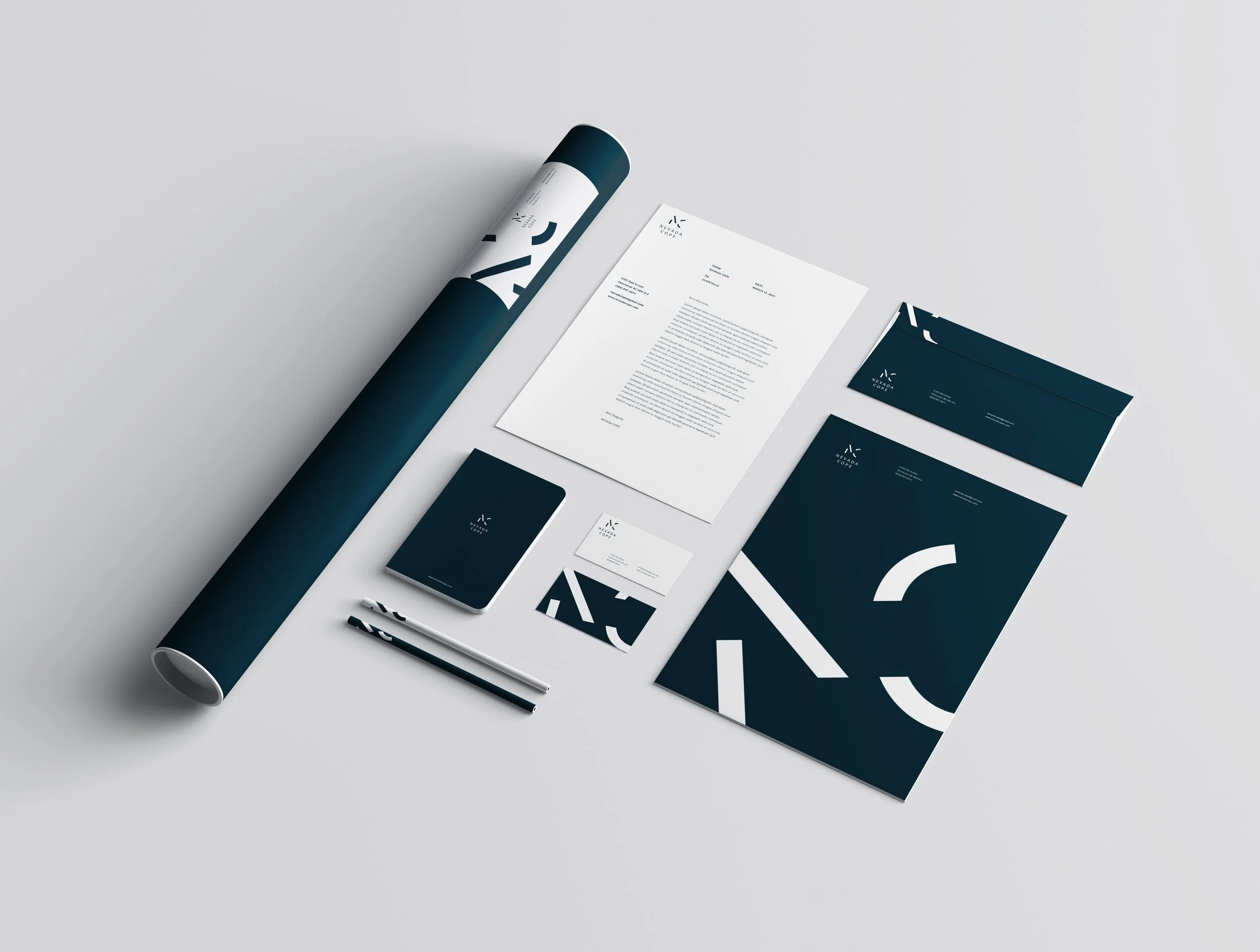
When Nevada approached me, she was clear about her objective: to break away from the conventional real estate branding and create something truly distinctive. She wanted a brand that was minimal yet striking, hella-neat, and imbued with an abstract flair. The concept was to incorporate abnormal juxtapositions that would make her stand out in a competitive market.
Working with Nevada was a collaborative journey of creativity and innovation. The result is a branding design that perfectly encapsulates her professional ethos and avant-garde style, setting a new standard in real estate branding.